
Recommended Stuff
Recent
Recent blog posts
- Five perhaps not-so-known PHP tricks for leaner and cleaner code
- PHPEclipse and PDT
- Kilowatts & Vanek are back, better than ever
- The future of my phpBB templates
- Checking in
- Web Design or the Art and Science of Solving Problems (Part 1)
- Lost in thought
- An easy way to display a customized menu in your Drupal theme
- Back on the blog with a CSS rant
- Eternal* fame on the red planet for free
Search this site with Google
American Offroad
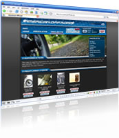
American Offroad specializes in the offroad experience and for that you need quality parts for your vehicle. Their ecommerce site sells offroad parts and equipment for motorcycles and trucks.
Working with the already existing materials such as logotype and branding, I attempted to give the site a clear engine and motorsports feel. Doing this I took a structured approach to the task, for example, when designing interaction make sure that when there's a choice for the user to make, be sure you present a choice. However a choice doesn't necessarily mean that the two options appear equal or are equally appealing. If you want to direct users toward a certain action, use the means you have to encourage the user, never limit the user as that leads to frustration. This was my approach to the classical product screen where I decided to make the "add to cart" button big, appealing and almost screaming "click me". The same theory was applied in creating other parts of the site.
I built this design working with Gabriel Isenberg who was doing the development of the ecommerce system and who contacted me for the design work. I delivered sliced graphics which Gabriel then used in building the pages according to the designs I had sent over. This website is still being developed but will be available some time in the spring of 2006.
Screenshots


